Hello World!
January 1st, 2026Welcome!
HAPPY NEW YEAR!!!
This year, I kick off January 1st with something special... something secretive... something personal... can you guess? It's this website! I've been working on it on-and-off for several months now, and finally got the chance to finish it just this winter break. I'm really glad with how it turned out in terms of design and functionality, but even more so in terms of how representative it is of me.
My simplistic personal branding (the red stamp) alongside the very minimal layout of the site reflects a part of me that loves all things quiet. Be it working my best at night, loving hikes, or loving to sleep, silence leaves me feeling the most fulfilled.
The design also speaks to my uniquely Korean-American identity.
The pairing of the rather dirty painting and calligraphy, alongside the very clean and obviously Swiss-style design, reflects ideas conveyed in graffiti. Specifically, the idea that beauty can emerge through structured chaos. To me, having grown up in New England, this idea is very prominent in NYC and Boston culture; not just because graffiti there is commonplace, but because these urban centers house so much success despite all the crazy stuff that happens there every day (I say this, but it's probably due to some confounding variable). This is my American identity (or rather, a part of it).
And a bit more obviously, the Korean painting, calligraphy, and red stamp speak for my Korean identity. Hopefully, I don't need to explain that.
Combined, these elements represent me: a Korean-American who loves quiet.
Honestly, I don't know where I'm going with this. See you in the next section.
More about this site
Welcome back.
While developing this website, I looked back on my past projects for some inspiration, and was honestly shocked by how far I've come.
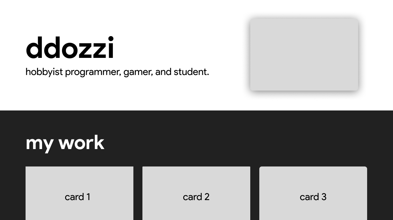
here is my first personal website, made about 1 year after I learned web dev in 7th grade:
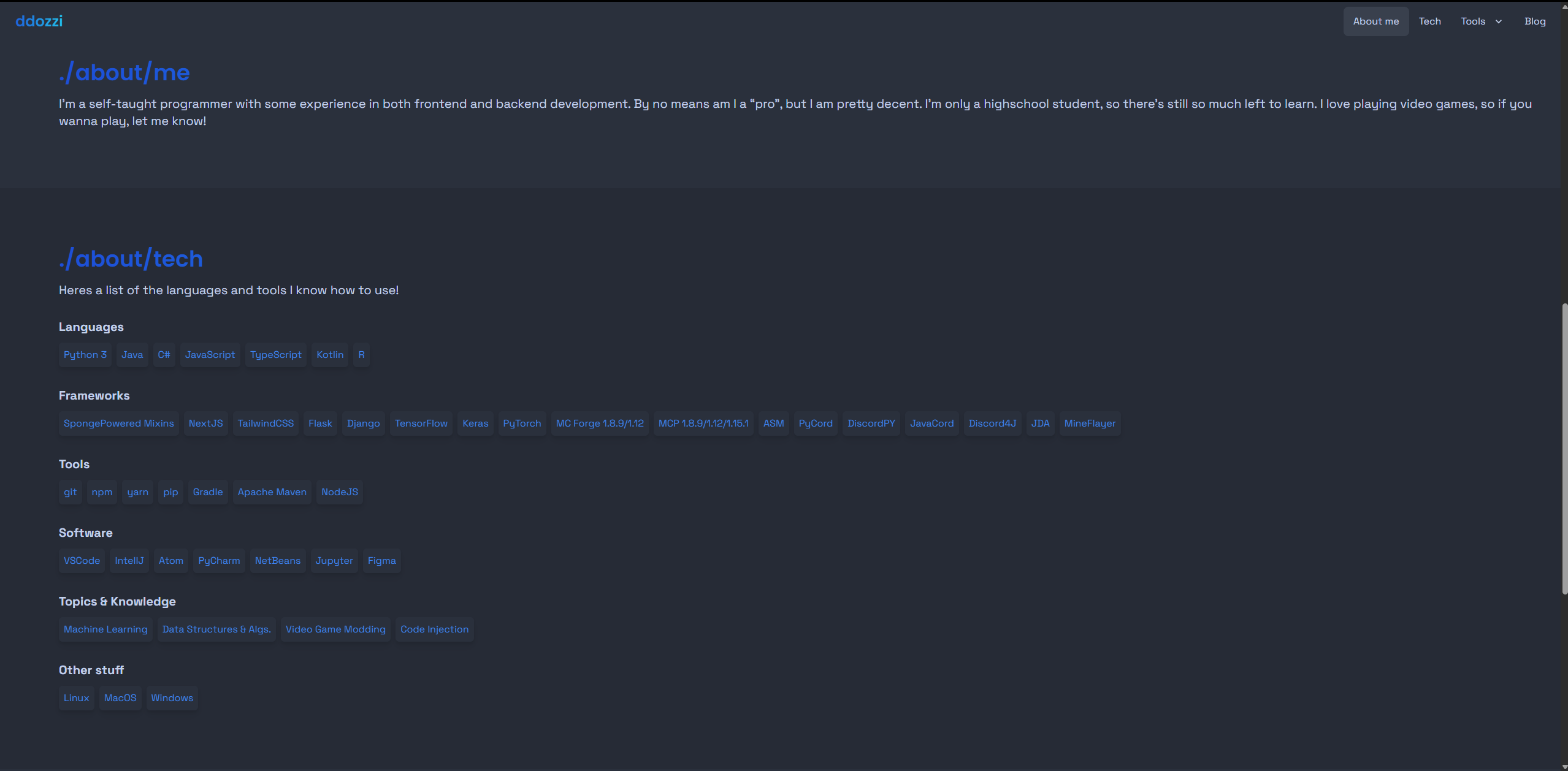
Not too bad.
If I recall correctly, that site uses NextJS, TailwindCSS, and DaisyUI. And looking at stuff from a foundational level, this website really isn't that different. It uses NextJS, TailwindCSS, and GSAP.
I don't really know what else to talk about so let's look at some of my other old designs and discuss:
here's a design of my portfolio about a month after the last one:
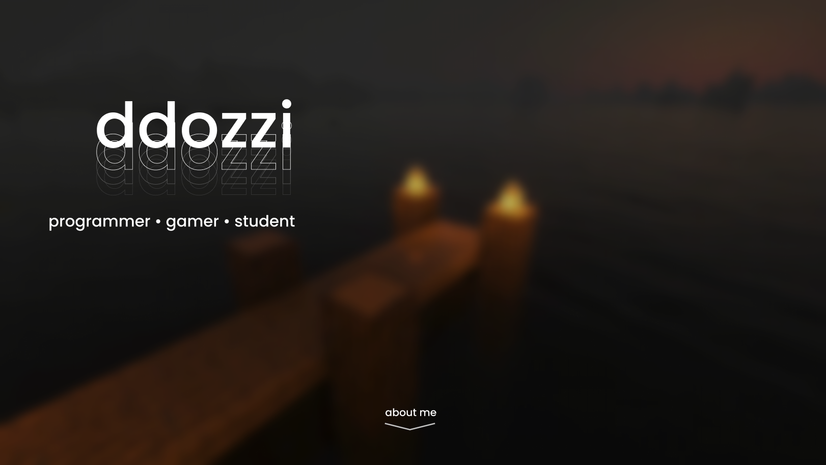
Also not bad. (If you couldn't tell already, I've always been a really big fan of minimalism.)
I would link the website here if I could, but unfortunately my GitHub account was BANNED a few months ago. I lost quite literally everything. But that's a story for another day.
here's a design of my portfolio about a week after the last one:
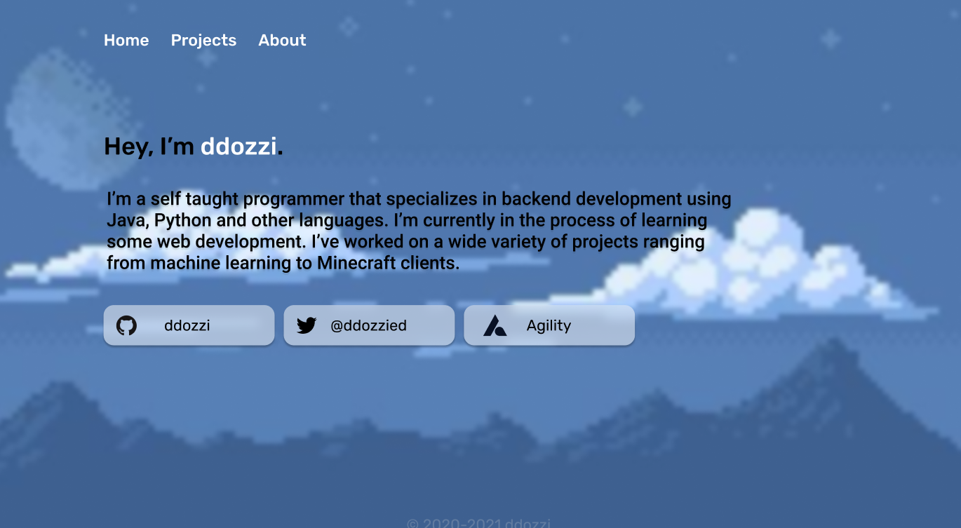
Not looking too great. Contrast is off, there's some weird drop shadow stuff going on, and overall cohesion just isn't great.
Luckily, I came to the same realization later that day and fixed it:
I like it.
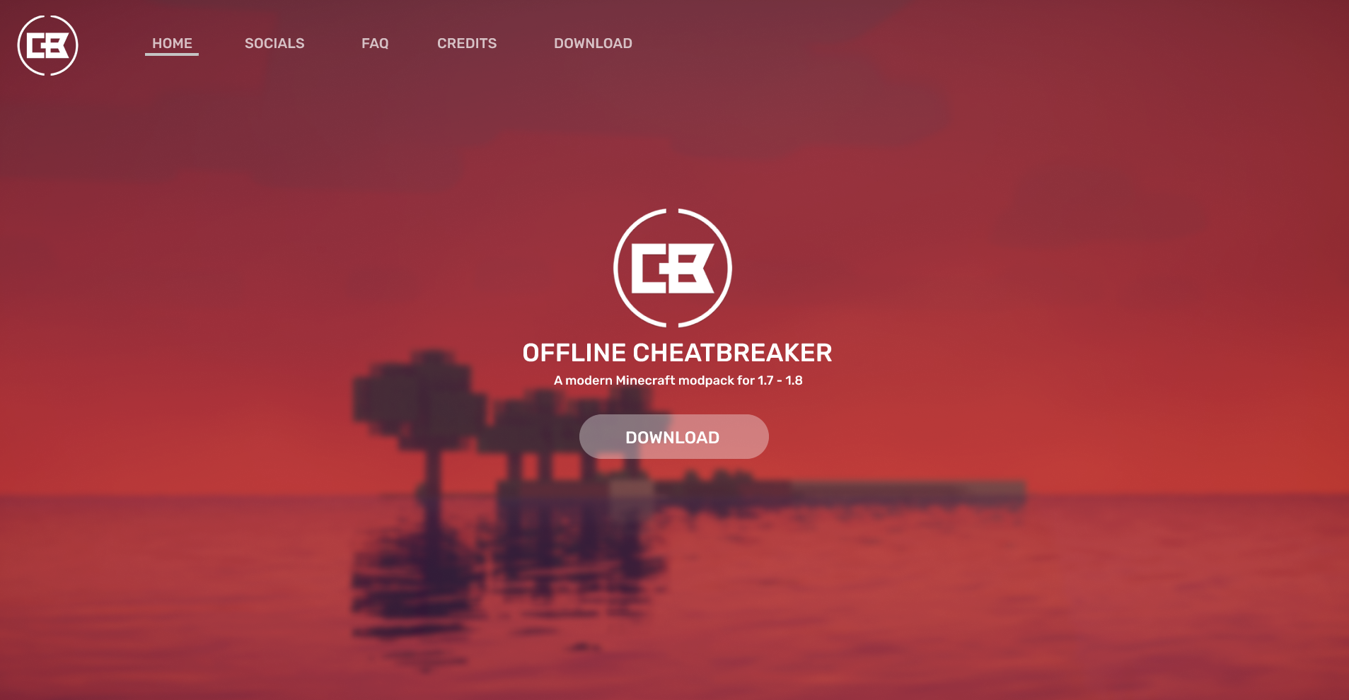
But about a week later, I got sick of it and designed another one:
I remember this one very well because it was the first website where I learned about responsiveness (i.e., making websites resize and change shape depending on the device you view it on).
I was trying to teach myself responsive design when I could barely understand HTML and CSS. I was genuinely ripping my hair out while trying to do this. I spent a solid week on it before moving onto... much more interesting things. Oh, and I don't think I ever got it to be responsive lol.
Around a year later, after taking a break to focus on Minecraft modding (where I learned Java, bytecode manipulation, reverse engineering, deobfuscation, and A LOT of other very useful skills; maybe I'll write a blog post on it in the future), I returned to web design with a renewed sense of confidence. I had learned a lot about design the previous year while working on Minecraft clients, rediscovering basic design ideas from first principles, and was ready for a fresh start.
Here was the first website I made after that break:
Not bad dude. This one actually looks usable.
Right after that, I got a bit cocky and tried to redesign our magnet program's website:
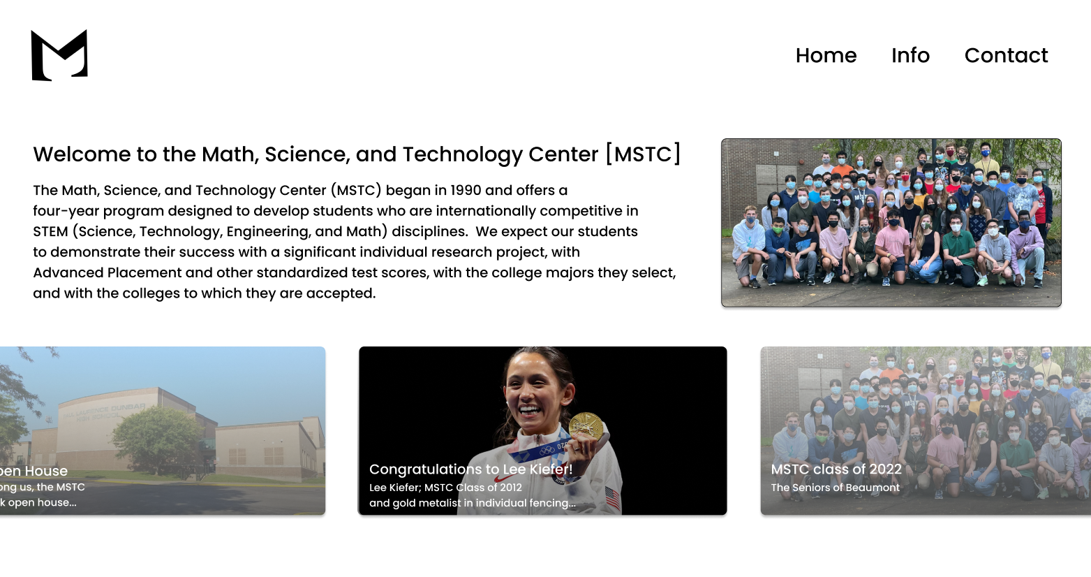
Yeah. Not so great.
Very poor scaling and padding issues here. The navbar text is wayyy too large, all the text is bold for some reason, and there are way too many drop shadows. Also, why is the whole site just the hero section? Weird.
After that, I got tired of web design and development. It seemed like no matter what I did, I could only make stuff that was mediocre.
So I quit.
Kinda.
I stopped designing for a while, but I made a very conscious effort to notice all the design elements in things I walked by every day. Some days it was my desktop, other days it was a book cover or some packaging, but most days it was just other websites.
Over time, I developed a pretty keen intuition for design.
Fast-forward 2 years, and I came up with this:
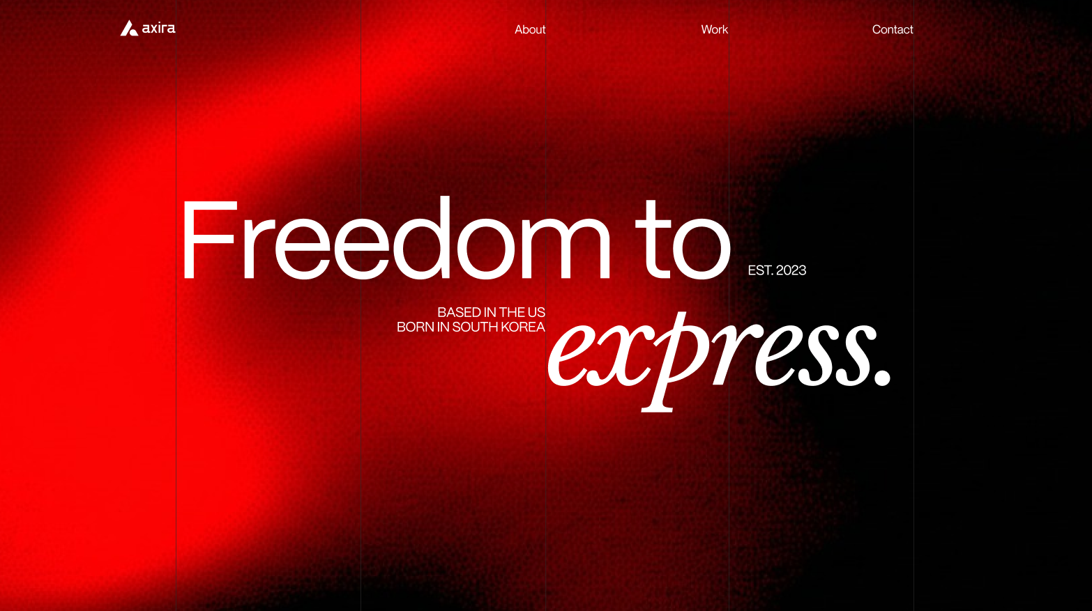
It's amazing.
Was what I thought immediately after creating it. But about a week later, I hated it.
So I made another design. Loved it. Hated it. Trashed it.
Then I made another one. Loved it. Hated it. Trashed it.
Then another one. Love. Hate. Trash.
Again and again and again for about a year.
Here's what that looked like:
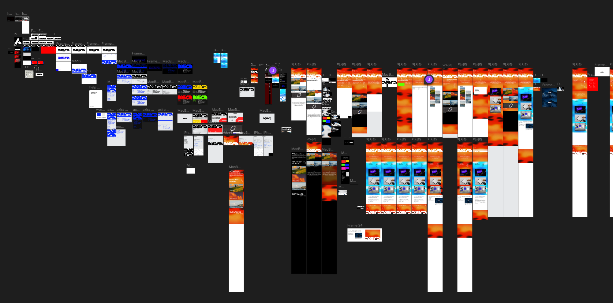
It starts in the top left and slowly works its way toward the right.
(There's a lot more stuff that's just not being shown. What's shown is about 3 months of work.)
Then, finally, after more than a year, I finally came up with one I actually liked:

I even put it in a little mockup to make it look cooler. Neat, eh?
And a bit later, I made this website.
And now I make websites for others as well (for free).
I don't know how this went from being about my new portfolio to my history as a web developer, but here we are.
I swear that going forward, these blog posts will be less yap-y and more planned, cohesive, and on a subject of more substance than this time. I'm just in a rush trying to get this out before 12:00 AM Jan. 2nd. which is why everything is so poorly written.
Anyway, thanks for reading.
If you have any ideas or questions, feel free to email me. My inbox is always open.